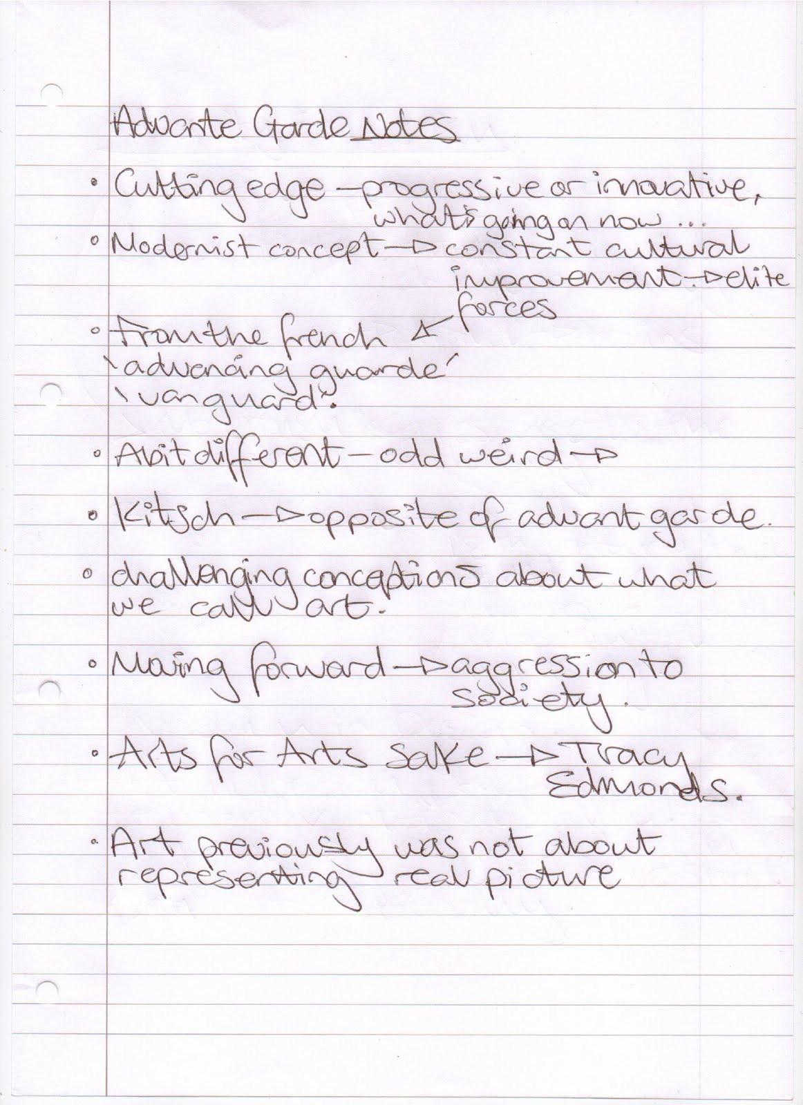
These bullet points below were taken from ‘With aid of text ‘Thinking with type (Lupton, E, 2008)’ and describes the relationship between a designer and text:
Text
· “Letters gather into words, words build into sentences.” In typography, “text” is defined as an ongoing sequence of words, distinct from shorter headlines or captions. The main block is often called the “body” comprising the principal mass content. Also Known as “running” text, it can flow from one page, column, or box to another. Text can be viewed as a thing- a sound and sturdy object-or a fluid poured into the containers of page or screen. Text can be solid or liquid, body or blood.”
· “Designers provide ways into-and out of-the flood of words by breaking up text into pieces and offering shortcuts and alternate routes through masses of information.”
· “Typography helps readers navigate the flow of content.”
· “Although many books define the purpose of typography as enhancing the readability of the written word, one of design’s most humane functions is, in actuality, to help readers avoid reading.”
Error and ownership
· “Typography helped seal the literary notion of “the text” as a complete original work, a stable body of ideas expressed in an essential form. Before the invention of printing, handwritten documents were riddled with errors. Copies were copied from copies, each with its own glitches and gaps.”
· “Printing with movable type was the first system of mass production, replacing the hand-copied manuscripts. As in other forms of mass production, the cost (setting type, insuring its correctness, and running a press) drops for each unit as the size increase”
· “Since the rise of digital tools for writing and publishing, manuscripts have all but vanished.”
· “Print help establish the figure of author as the owner of a text.”
Spacing
· “The typographers art concerns not only the positive grain of letterforms, but the negative gaps between and around them. In letterpress printing, every space is constructed by a physical object, a blank piece of metal or wood with no raised image.”
· “Spoken language is perceived as a continuous flow, with no audible gaps. Spacing has become crucial, however, to alphabetic writing, which translates the sound of speech into multiple characters.”
· “Spaces were introduced after the invention of the Greek alphabet to make words intelligible as distinct units.”
· “Tryreadingthislineoftextwithoutspacingtoseehowimportantithasbecome.With the invention of typography, spacing and punctuation ossified from gap and gesture to physical artifact. Punctuation marks, which were used differently from one scribe to another in manuscripts era, became part of the standardized, rule-bound apparatus of the printed page.”
· “Typography made text into a thing, a material object with known dimensions and fixed locations.”
· “The French philosopher Jacques Derrida, who devised the theory of deconstruction in the 1960’s wrote “Typography manipulates the silent dimensions of the alphabet, employing habits and techniques- such as spacing and punctuation- that are seen but not heard.”
Linearity
· “In his essay ”From Work to Text,” the French critic Roland Barthes presented two opposing models of writing: the closed, fixed “work” versus the open, unstable “text”. In Barthes view, the work is tidy, neatly packaged object, proofread and copyrighted, made perfect and complete by the art of printing. The text, in contrast, is impossible to contain, operating across a dispersed web of standard plots and received ideas… He also anticipated the Internet as a decentralized web of connections.”
· “The singular body of traditional text page has long been supported by the navigational features of the book, from page numbers and headings that mark a reader’s location to such tools such as the index, appendix, abstract, footnote, and a table of content’s. These devices were able to emerge because the typographic book is fixed pages.”
· “Whereas talking flows in a single direction, writing occupies space as well as time Tapping that spatial dimensions- and thus liberating readers from the bonds of linearity-is among typography’s most urgent tasks.“
· “Although digital media are commonly celebrated for their potential as nonlinear potential communication, linearity nonetheless thrives in the electronic realm, from the”CNN crawl” that marches along the bottom of the television screen to the ticker style LED signs that loop through the urban environment.”
· “Linearity dominates many commercial software applications. Word processing programs, for example, treat documents as a linear stream.”
· “In contrast, page layout programs Such as Quark and adobe InDesign allows users to work spatially, breaking up text into columns and pages that can be anchored and landmarked.”
· “Not all digital media favor linear flow over spatial arrangement, however. The database, one of the defining information structures of our time is a nonlinear form. Providing readers and writers with a simultaneous menu of options, a database is a system of elements that can be arranged in countless sequences.”
· “Typography has evolved from a stable body of objects toa flexible system of attributes.”
Birth of the user
· Barthe’s model of the text as an open web of references, rather than a closed and perfect work, asserts the importance of the reader over the writer in creating meaning. The reader “plays” the text as a musician plays an instrument”
· “Like an interpretation of a musical score, reading is a performance or written word.”
· “Redefining typography as “discourse,” designer Katherine McCoy imploded the traditional dichotomy between seeing and reading. Pictures can be read (analyzed, decoded, taken apart), and words can be seen (perceived as icons, forms, patterns). Valuing ambiguity and complexity, her approach challenged readers to produce their own meanings while also trying to evaluate the status of designers within the process of author ship.”
· “The dominant subject of our age has become neither reader nor writer but user, a figure conceived as a bundle of needs and impairments-cognitive, physical, emotional.”
· “Graphic designers can use theories of user interaction to revisit some of our basic assumptions about visual communication. Why, for example, are readers on the less patient than readers of print? It is commonly believed that digital displays are inherently more difficult to read than ink on paper. Yet HCI studies conducted in the late 1980’s proved that crisp black text on a background can be read just as efficiently from a screen as from a printed page.”
· “The cultural habits of the screen are driving changes in design for print, while at the same time affirming print’s role as a place where extended reading can still occur.”
· “Another common assumption is that icons are a more universal mode of communication than text…Yet they can often provide a specific and understandable cue than a picture. Icons don’t simplify the translation of content into multiple languages, because they require explanation in multiple languages, because the require explanation in multiple languages. The endless icons of digital desktop function more to enforce brand identity than to support usability.”
· “The beauty and wonder of “white space” is another modernist myth that is subject to revision in the age of the user. Modern designers discovered that open space on a page can have as much physical presence as printed areas.”
· “In our much –fabled era of information overload, a person can still process only one message at a time. This brute fact of cognition is the secret behind magic tricks: sleights of hand occur while the attention of the audience is drawn elsewhere. Given the fierce competition for their attention, users have a chance to shape the information economy by choosing what to look at. Designers can help you make satisfactory choices.”
· “Typography invented in the renaissance, allowed text to become a fixed and stable form. Like the body of the letter, the body of text was transformed into an industrial commodity that gradually became more open and flexible.”
· “The computer display is more hospitable to text than the screens of film or television because it offers physical proximity, user control, and a scale appropriate to the body.”
· “The printed book is no longer the chief custodian of the written word. Branding is a powerful variant of literacy that revolves around symbols, icons, and typographic standards, leaving its marks on buildings, packages, album covers websites, store displays, and countless other surfaces and spaces.”


